SkyShowtime homepage redesign
A simpler, content-first homepage that helps people find what to watch and take the next step.
The challenge
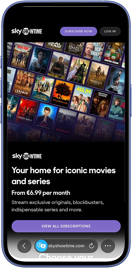
The homepage had become cluttered. User feedback showed that films and series were difficult to distinguish and new content lacked visibility. Analytics showed that 85% of users did not interact with the second half of the page.
The hypothesis was that a streamlined homepage, with content at its centre, would improve engagement, conversion and scroll time.
My contribution
Developed the hypothesis and led the creative brief. Created, tested and iterated the designs, then produced a full rollout plan.
- Used customer feedback and performance evidence to identify friction.
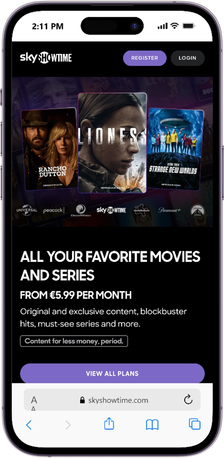
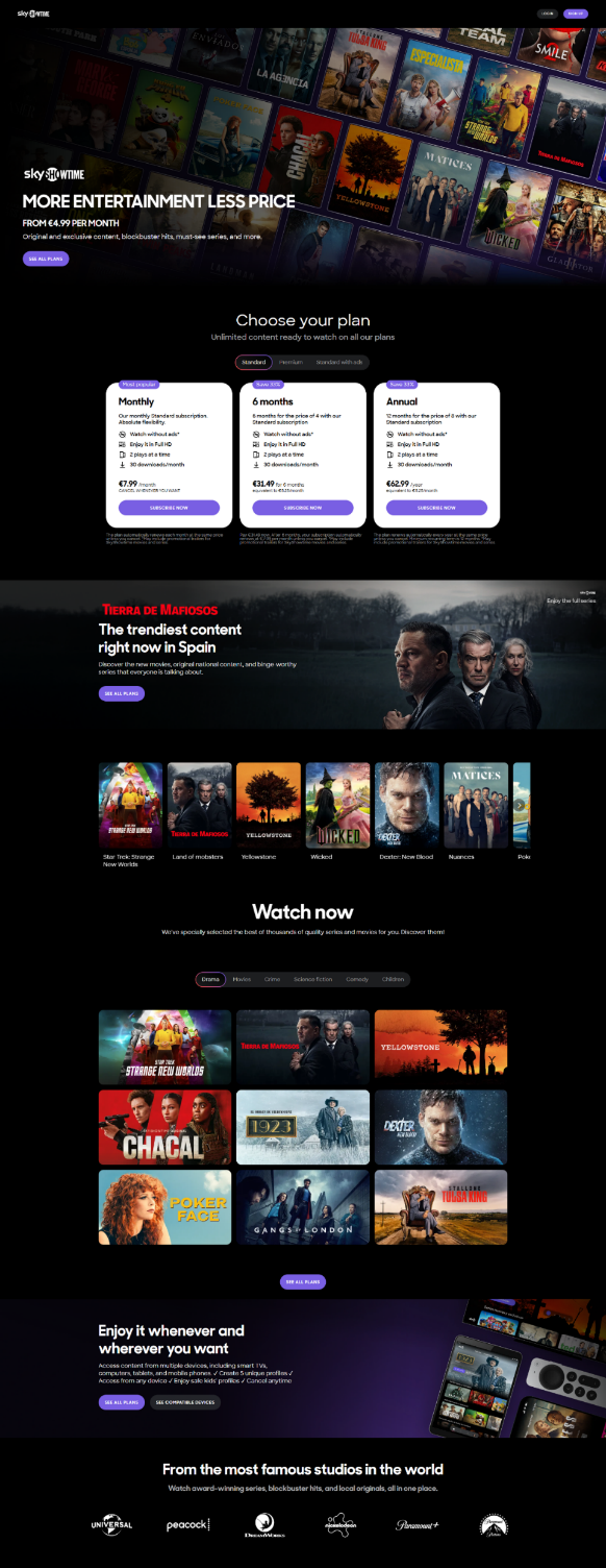
- Designed a clearer hierarchy with larger content tiles and more visible studio branding.
- Separated films and series, introduced top-10 content cues and clarified pricing.
- Tested the experience and used the results to inform further iterations and rollout planning.
Other parts of the page
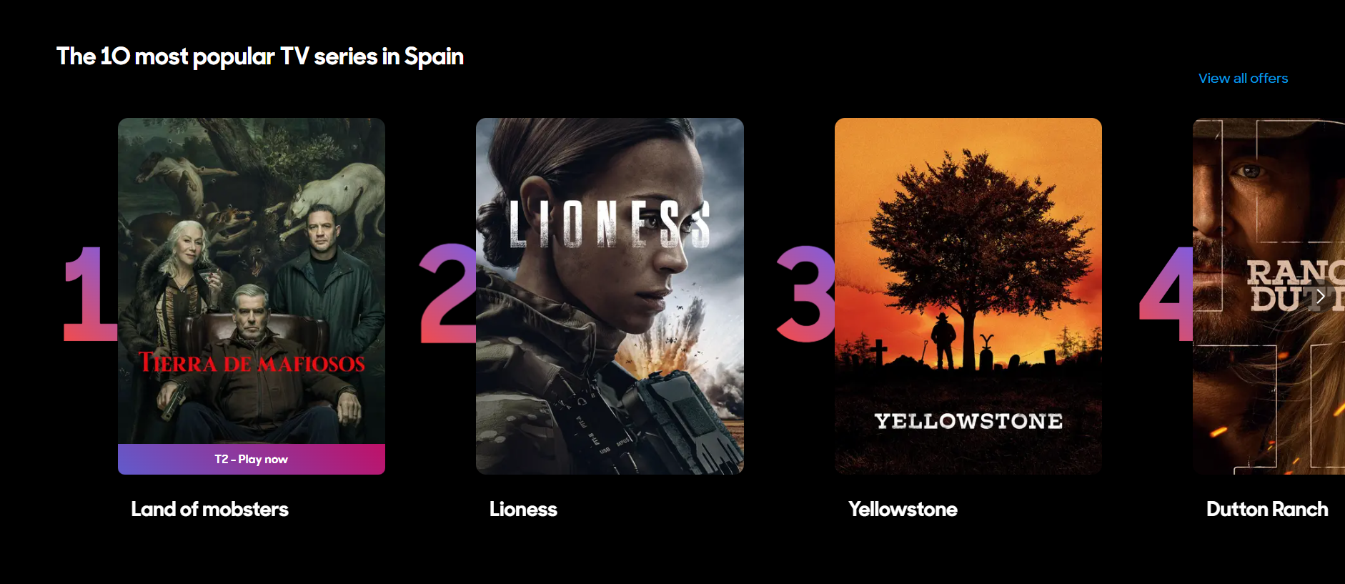
Popular content at a glance
Numbered rails give popular titles more prominence and help visitors understand what others are watching.
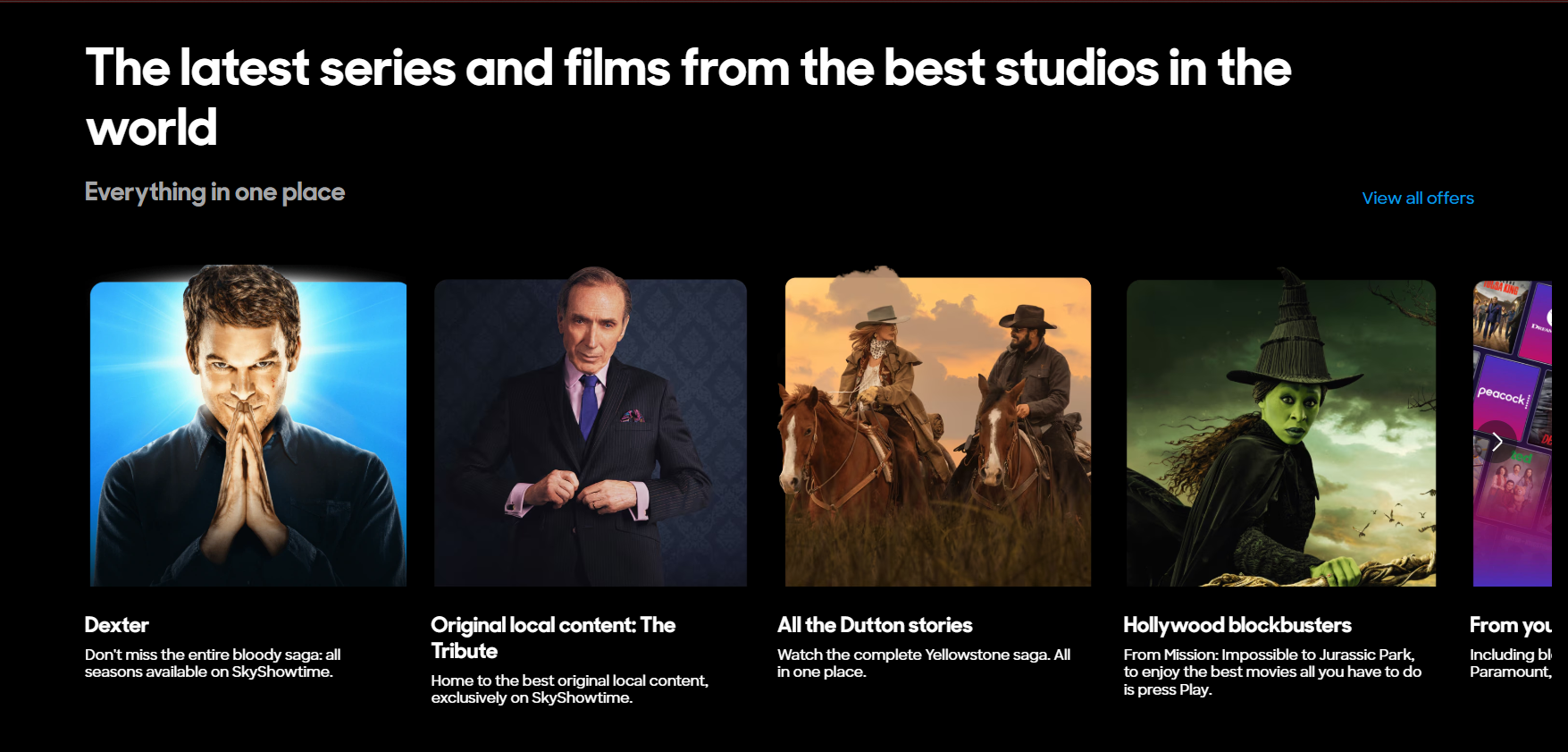
Editorial content and franchise discovery
Curated sections bring together standout series, local originals, franchise collections and films, giving visitors more ways to discover the catalogue.
The results
The homepage redesign delivered a 6% uplift in conversion rate. Revenue moved up 2% overall.
A homepage that kept evolving
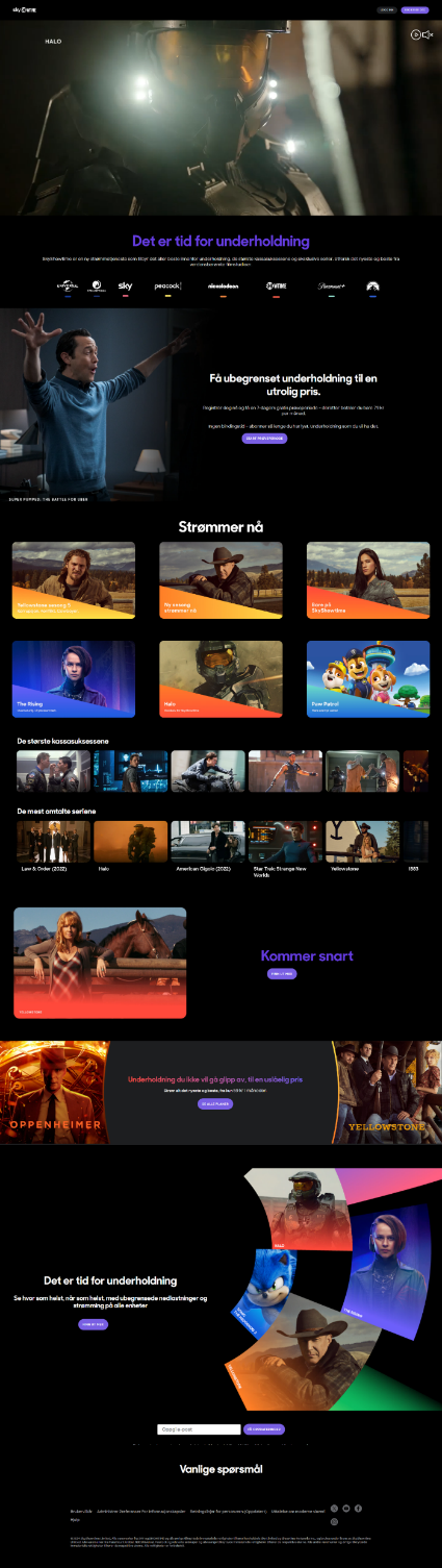
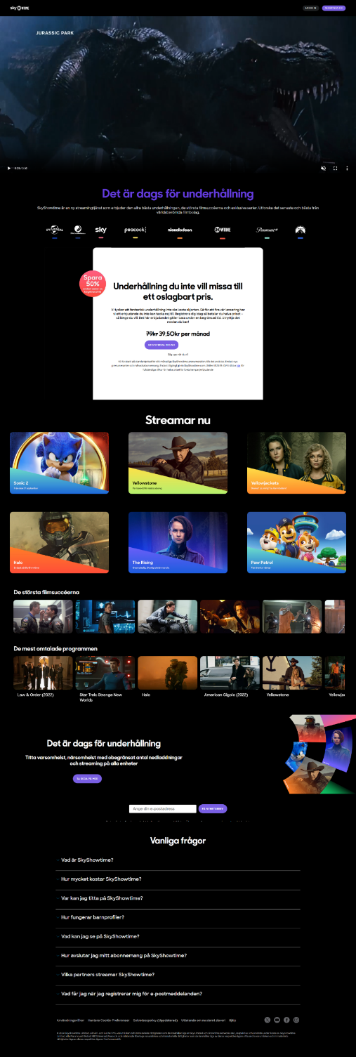
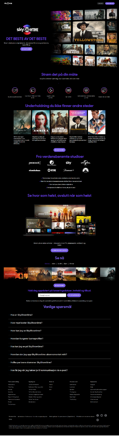
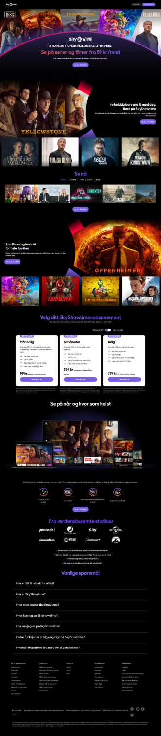
The latest redesign followed a series of earlier homepage iterations. Together, they show how the experience evolved as the proposition, content and merchandising needs changed.
What came next
Translated the findings into a rollout plan and further test opportunities, including rail behaviour, content messaging and hero formats. The approach allowed for market-specific iteration.
Interested in working together?
Connect with me on LinkedIn or request a copy of my CV.